In the United States to date, there have been 7.7 million COVID-19 cases and over 215,000 resultant deaths. While there are countless ways to look at the underlying data, one doesn’t need a background in data analytics to grasp the harsh reality that these numbers suck. We can use appropriate analytics to visualize how badly we suck. Unfortunately, such an exercise provides no consolation whatsoever.
However, since relative suckage is relevant in the political realm, I’ll continue my attempts at visualizations. In past postings, I’ve looked at COVID-19 numbers by country, state, and metropolitan area in various ways. Some of my analytics provided politically relevant information; others not so much. For this iteration, I’ve attempted to address just two questions that may be relevant to the 2020 elections:
- How badly does the U.S. suck relative to other countries?
- Within the U.S., how badly is each state sucking relative to one another?
I still like my bubble chart to visualize an answer to Question 1. Here, I’m happy with a static point-in-time snapshot that concurrently shows per-capita cases, death rates, and test rates. While the analytic will only be finalized in retrospect once the virus is contained, a time component isn’t really necessary to convey how the U.S. currently compares to the rest of the world. That said, a July post contains a prior version of this chart. Below is the chart as of 10/3. Click on the graphic to display a larger version; hit the back button to return here.
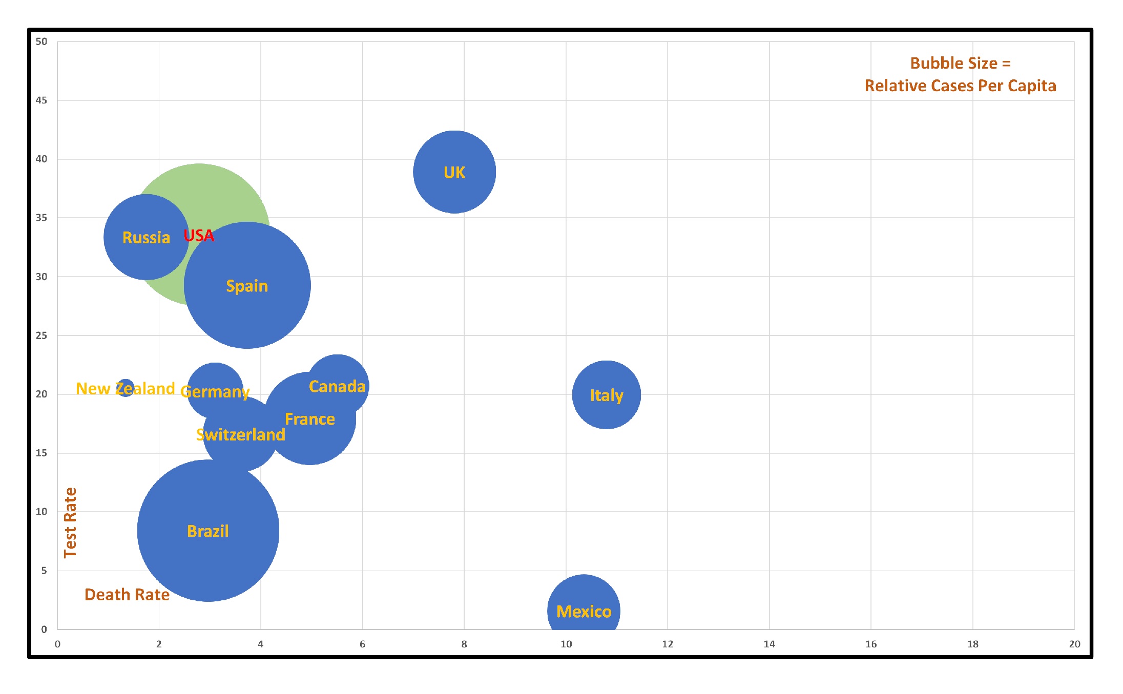
I did remove Iceland from this update. It turns out that Iceland is doing so well with COVID-19 that they threw off my visualization. With a test rate of 86% (!) and a death rate of 0.3%, one can imagine their tiny dot to be positioned way upper left, above the chart.
The U.S. is finally doing relatively better with respect to testing and, like most countries, our death rate is decreasing. However, we’re still the worldwide leader with our per-capita case count – and that’s just embarrassing. Given our national resources, it’s inexcusable that we’re not the country that breaks the analytic.
A visualization to answer Question 2 is trickier. Here, given our non-existent national response and the rapidly changing rules and regulations at the state and local levels, the time component seemed more relevant. I settled on weekly tracking of new cases per capita as the best metric to gauge relative progress while minimizing the impact of daily noise. The number are visualized on a map of the U.S. with the darker state shades reflecting a higher per capita case count. The following video compresses 33 weeks of the pandemic into about a minute:
From this perspective, it’s interesting to note that the original New York and Louisiana hotspots fairly quickly gave way to a spread across the entire country. Despite Trump’s blather, COVID-19 isn’t party-aware – as evidenced by per-capita spikes in states as diverse as Arizona, Florida, Wisconsin, Iowa, and North Dakota. The virus has ebbed and flowed throughout the U.S. and it is showing no signs of retreat.