In this update to my COVID-19 analytics, now reflecting 7/10/2020 data, I’m revising my approach. There are plenty of other sites that have clever and innovative ways of communicating the incredible extent to which we’re screwed. For my part, I’ll try to focus my efforts on the potential impacts of COVID-19 on U.S. politics.
For now, here’s some big-picture visualizations that show how the U.S. is doing in comparison to other countries, how 2020 swing states are doing in comparison to other swing states, and how a few states and major metropolitan areas are progressing. Click on any graphic below to display a larger version; hit the back button to return here.
COVID-19 Comparisons
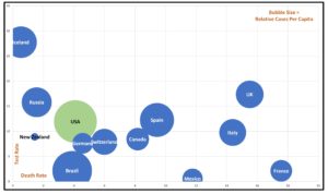
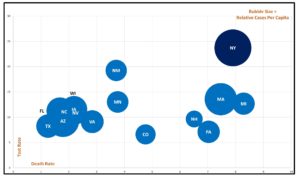
The first two visualizations are bubble charts – which convey a lot of information in one chart. For both, the size of each bubble is the relative size of the spread, adjusted as a percentage of population; the X axis reflects the death rate; the Y axis reflects the testing rate.
By Country
Trump is continually claiming victory over COVID-19, hoping that voters will just take his word for it. In fact, the U.S. has the largest number of cases per capita in the world. “America First” is a reality. Our testing rate is slightly better than many countries, but given our resources, our level of testing is decidedly unimpressive. We do have a relatively low death rate thus far, but again, it’s not the best. As a country, we have no cause at all for celebration. While there are plenty of other criteria upon which to judge the Trump administration, its COVID-19 response will be front and center in November.
By State
While New York still has the most cases, it is no longer the sole epicenter. As we’ll see below, it will likely be eclipsed shortly. All of the lighter blue bubbles are at least somewhat interesting in the 2020 political landscape and none have things under control. Of note is that the low test rates of many swing states could well be masking even larger problems.
COVID-19 Progressions
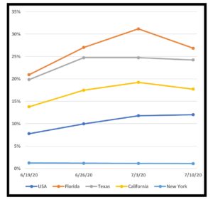
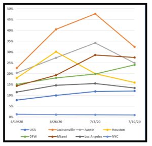
While the prior visualizations are snapshots, the next two show progressions over time, with the national numbers as a reference. These graphs plot rates of increase. Thus, even rate drops are not necessarily great news. If the rate itself is still significant, a drop means that things are getting worse a bit slower than before – but they are still getting worse every week.
By State
In future posts as we get closer to the election, I’ll look deeper into individual swing states. For now, the take-away is that Florida and Texas are out of control with their weekly case rates currently increasing by 27% and 24%, respectively. New York’s rate, on the other hand, is holding steady at only about 1%. While both Texas and Florida are still stretch goals for Biden at the moment, winning the Electoral votes of either would all but lock up the election.
By Metropolitan Area
This graph digs a bit deeper into a few metropolitan areas in the above states with the national numbers as a reference. It’s not pretty.
Primary data sources: New York Times, COVID Tracking Project, Texas DSHS, Worldometer, US Census Bureau


