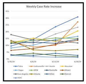
Here’s an update to my COVID-19 analytics, now reflecting 6/20/2020 data. This snapshot begins to show the impact of the lifting of restrictions in the U.S. See below for commentary and some explanatory notes. Click on any table to display a larger version; hit the back button to return here.
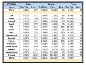
Selected Countries by % of Cases
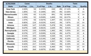
Selected States by % of Cases
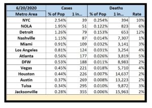
Selected Metropolitan Areas by % of Cases
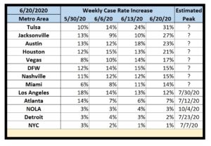
Selected Metropolitan Areas by Acceleration Rate
Commentary
- The U.S. now leads the world in COVID-19 cases per capita. Go team!
- Iceland still leads the world in COVID-19 responses. They’ve tested 20% of their population and have a very low fatality rate of 1%.
- U.S. testing has improved, but it’s still nothing to celebrate. On a per capita basis, we’re still lagging behind numerous other countries.
- As expected, many U.S. metropolitan areas are now trending in the wrong direction. Increased testing is identifying more cases, but that doesn’t nearly account for the spikes. The relaxation of restrictions has been largely unsuccessful. This is not a second wave; it’s a resurgence of the first wave.
- While some of the original U.S. hotspots (NYC, New Orleans, Detroit) still have the highest percentages of cases at the moment, their acceleration rates are significantly lower than some new hotspots (Houston, Dallas, Las Vegas, DFW). The problem definitely didn’t go away. It just moved.
- My home state of Texas yet again looks at first glance like it’s doing well. Of the states I currently track, we have the least number of reported cases per capita. However, we still rank near the bottom in testing and, more importantly, there are rising rates of cases in major Texas metropolitan areas: 15% in DFW, 21% in Houston, and 23% in Austin.
- Some of my “Estimated Peak” dates are now unknown. When acceleration rates are rising, there is no end in sight. Note again that any constant rate of acceleration is bad. Even a low rate of acceleration still means that the problem is getting worse every single week.
- I started tracking Tulsa (the site of Trump’s recent rally) and Jacksonville (the site of the Republican convention in August). Each is already trending in the wrong direction and I suspect their numbers will get worse.
- I added a simple line chart corresponding to the weekly case rate increase table for the metropolitan areas that I track.
Approach
- Most published analytics focus on case counts. However, case counts are only meaningful in the context of potential case counts. I thus look at the percentage of cases within a given population center. Since these percentages are mostly less than 1% (at least for now), I also report cases in terms of an easier to grasp “One of Every N People”.
- I report deaths as a percentage within a given population center, in terms of “One of Every N People”, and as a percentage of the reported cases (the fatality rate).
- I currently follow hard-hit states, 2020 toss-up states, and a few others.
- I also currently follow several metropolitan areas in the U.S. Since the virus spreads via close contact, this would seem to be the most useful information. For these, I add a simple means to track progression. Within four rolling weeks (to avoid both daily noise and old data), I report the rate of increase in the number of cases. This is akin to tracking the acceleration of the infection. Obviously, the goal is to first get the acceleration to zero with a resultant constant rate of infection. Only then can the area begin to decelerate until the actual number of new cases approaches zero. Finally, I add an extremely rough linear projection as to when each area could reach an acceleration of zero if everything stays the same (which it won’t). If the rate of acceleration in increasing, no end date can be calculated.
- My primary data sources: New York Times, COVID Tracking Project, Texas DSHS, Worldometer, US Census Bureau.
- All analytics are only as good as the underlying data and there are numerous reasons to question the validity of some of my datasets.
- Some entities only report confirmed cases; others report presumed cases. Some entities (e.g. China) are pretty obviously under-reporting their numbers.
- Case counts depend on access to testing and that varies wildly from country-to-country, state-to-state, and county-to-county.
- Reporting on testing itself is even more uneven. My data source for U.S. test data felt the need to grade each state’s data quality.
- While I attempt to normalize data from multiple sources, the fact remains that each source dataset is independently generated with its own collection methodology.
- If asked nicely, I can try to add reporting for other countries, states, and/or metropolitan areas in future posts.
