Here’s an update to my prior COVID-19 analytics, now reflecting 5/23/2020 data. This snapshot is largely prior to the free-for-all lifting of restrictions in the U.S. See below for commentary and some explanatory notes. Click on any table to display a larger version; hit the back button to return here.
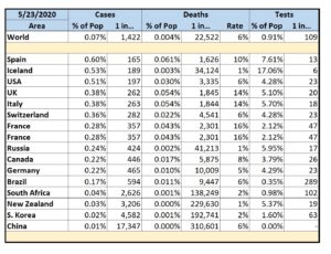
Selected Countries by % of Cases
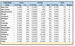
Selected States by % of Cases
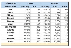
Selected Metropolitan Areas by % of Cases
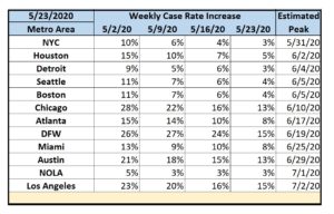
Selected Metropolitan Areas by Estimated Peak
Commentary
- The new orders vary greatly from state-to-state so it will be quite interesting to see how things look in a 2-3 weeks. Since the current numbers show some progress, I suspect the trends will be reversed. I seriously hope I’m wrong.
- Despite claims otherwise, the data shows that the overall U.S. response to COVID-19 has been decidedly sub-par. Of the countries I track, only Spain and Iceland have more reported cases per capita – and those countries lead in testing. Victory laps are decidedly premature.
- Iceland has now tested 1 out of every 6 of their residents – far more than anyone else – and they’ve proven that a large number of people with COVID-19 are asymptomatic carriers. Iceland’s overall success is underscored by a very low fatality rate of 1%.
- In the U.S., NYC is still the major hotspot with 1 in 42 people testing positive. Detroit has the worst fatality rate at 12%.
- My home state of Texas once again looks like it’s doing well… until you look a bit deeper. Of the states I currently track, we do have the least number of reported cases per capita. Unfortunately, “reported” would be the key word here. Our testing is pathetic. We’ve tested only 2.59% of our population – compared with 4.28% nationwide. And that national testing percentage is still less than many other countries. Testing in my home city of Austin is even worse than Texas as a whole with only 1.93% of Austin residents tested. It is thus likely that neither Austin, nor Texas, nor the United States are doing nearly as well as they think they are. And yet, most restrictions have just recently been lifted.
- You may notice that my “Estimated Peak” dates keep moving out. My simple algorithm assumes that future reductions in the rates of increase are linear… and they clearly are not. This is not good news. Until a municipality can get the rate of increase to zero, their problem by definition is only getting worse. At first glance, New Orleans might appear to have a good handle on COVID-19 since their rate of increase has held steady at 3% for three weeks. However, what that means is that their problem is getting slowly worse every single week. Any constant rate of increase is definitely not a solution.
Approach
- Most published analytics focus on case counts. However, case counts are only meaningful in the context of potential case counts. I thus look at the percentage of cases within a given population center. Since these percentages are mostly less than 1% (at least for now), I also report cases in terms of an easier to grasp “One of Every N People”.
- I report deaths as a percentage within a given population center, in terms of “One of Every N People”, and as a percentage of the reported cases (the fatality rate).
- I currently follow states that are either the hardest hit or that are 2020 toss-up states. It’s too early to tell how COVID-19 will impact the swing states, but it will definitely be a major issue.
- I also currently follow several metropolitan areas in the U.S. Since the virus spreads via close contact, this would seem to be the most useful information. For these, I add a simple means to track progression. Within four rolling weeks (to avoid both daily noise and old data), I report the rate of increase in the number of cases. This is akin to tracking the acceleration of the infection. Obviously, the goal is to first get the acceleration to zero with a resultant constant rate of infection. Only then can the area begin to decelerate until the actual number of cases approaches zero. Finally, I add an extremely rough linear projection as to when each area could reach an acceleration of zero if everything stays the same (which it won’t).
- There are way too many variables at this point to model any future deceleration.
- My primary data sources: New York Times, COVID Tracking Project, Texas DSHS, Worldometer, US Census Bureau.
- All analytics are only as good as the underlying data and there are numerous reasons to question the validity of some of my datasets.
- Some entities only report confirmed cases; others report presumed cases. Some entities (e.g. China) are pretty obviously under-reporting their numbers.
- Case counts depend on access to testing and that varies wildly from country-to-country, state-to-state, and county-to-county.
- Reporting on testing itself is even more uneven. My data source for U.S. test data felt the need to grade each state’s data quality.
- While I attempt to normalize data from multiple sources, the fact remains that each source dataset is independently generated with its own collection methodology.
- If asked nicely, I can try to add reporting for other countries, states, and/or metropolitan areas in future posts.


