Since I had a positive response to my initial COVID-19 analytics, I’ll try to post updates on a semi-regular basis. This post uses data as of 4/24/20. See below for commentary and some explanatory notes. Click on any table to display a larger version; hit the back button to return here.
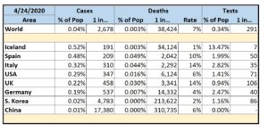
Selected Countries by % of Cases
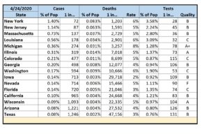
Selected States by % of Cases
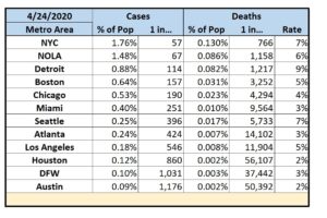
Selected Metropolitan Areas by % of Cases
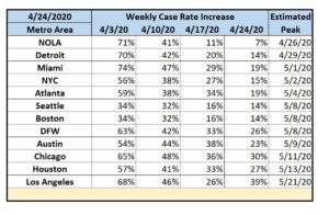
Selected Metropolitan Areas by Estimated Peak
Commentary
- Iceland continues to show the world how to handle COVID-19. With 1 in 191 people testing positive, they do show a higher incidence of cases than most countries. However, since Iceland has tested 1 out of every 7 of their residents – far more than anyone else – they’ve proven that a large number of people with COVID-19 are asymptomatic carriers. This implies that other countries conducting only minimal testing likely don’t know the extent of their actual problem. Iceland’s overall success is underscored by a very low fatality rate of 1%.
- The U.S. still lags in testing coverage at only 1 in 72 people.
- In the U.S., NYC is still the major hotspot with 1 in 57 people testing positive. New Orleans is close behind at 1 in 67. Detroit has the worst fatality rate at 9%.
- While my home state of Texas still appears to be doing comparatively well, Texas has pitiful testing coverage at only 1 in 121 people. Compare that to New York where 1 in 28 people have been tested. It’s likely we’re not doing nearly as well as we think we are.
- The data shows that current restrictions are working and also suggests that it’s too early to relax them. While businesses do eventually have to reopen, a few extra weeks would seem to be prudent.
Approach
- Most published analytics focus on case counts. However, case counts are only meaningful in the context of potential case counts. I thus look at the percentage of cases within a given population center. Since these percentages are mostly less than 1% (at least for now), I also report cases in terms of an easier to grasp “One of Every N People”.
- I report deaths as a percentage within a given population center, in terms of “One of Every N People”, and as a percentage of the reported cases (the fatality rate).
- I currently follow states that are either the hardest hit or are 2020 toss-up states.
- I also currently follow several metropolitan areas in the U.S. Since the virus spreads via close contact, this would seem to be the most useful information. For these, I add a simple means to track progression. Within four rolling weeks (to avoid both daily noise and old data), I report the rate of increase in the number of cases. This is akin to tracking the acceleration of the infection. Obviously, the goal is to first get the acceleration to zero with a resultant constant rate of infection. Only then can the area begin to decelerate until the actual number of cases approaches zero. Finally, I add an extremely rough projection as to when each area could reach an acceleration of zero if everything stays the same (which it won’t).
- There are way too many variables at this point to model any future deceleration.
- My primary data sources: New York Times, COVID Tracking Project, Texas DSHS, Worldometer, US Census Bureau.
- All analytics are only as good as the underlying data and there are numerous reasons to question the validity of some of my datasets.
- Some entities only report confirmed cases; others report presumed cases. Some entities (e.g. China) are pretty obviously under-reporting their numbers.
- Case counts depend on access to testing and that varies wildly from country-to-country, state-to-state, and county-to-county.
- Reporting on testing itself is even more uneven. My data source for U.S. test data felt the need to grade each state’s data quality.
- While I attempt to normalize data from multiple sources, the fact remains that each source dataset is independently generated with its own collection methodology.
- If asked nicely, I can try to add reporting for other countries, states, and/or metropolitan areas in future posts.


