I thought I’d share a few of my own COVID-19 analytics (using data as of 4/10/20). While I follow a wide variety of published sources, it can be tough to glean useful information from the reams of available data. For my own edification, I decided to hack together some simple analytics to give myself a better idea of what’s going on.
Is this politics? Not directly. But since COVID-19 will certainly impact the political landscape, it doesn’t hurt to better understand it.
First, a disclaimer: My analytics are only as good as the underlying data and there are numerous reasons to question the validity of some of that data. Case counts depend on access to testing and that varies wildly from country-to-country, state-to-state, and county-to-county. Some entities only report confirmed cases; others report presumed cases. Some entities (e.g. China) are pretty obviously under-reporting their numbers.
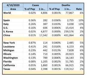
Since case counts are only meaningful in the context of potential case counts, I look at the percentage of cases within a given population center. Since these percentages are mostly less than 1% (at least for now), I also look at cases counts in terms of “One of Every N People”. I similarly look at deaths as a percentage within a given population center, in terms of “One of Every N People”, and as a percentage of the reported cases.
Hence, for example:
 My home state of Texas is doing pretty well with only 1 in every 2398 people testing positive. New York, however, is getting hammered with 1 in every 114 people testing positive. Yikes. Texas also has one of the lowest death rates at the moment; Michigan has the highest death rate.
While the above is interesting, it’s not particularly useful. From a practical standpoint, the most useful information is local – since the virus spreads via close contact. Hence, I take my deepest looks at the major metropolitan areas in the U.S.
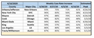
For these, I track the same metrics as above but add a simple means to track progression. I do the latter on a rolling, weekly basis (to avoid both daily noise and old data) as the rate of the increase in the number of cases. This is akin to tracking the acceleration of infection. With this metric, while moving from 80% to 50% is a significant improvement, we’re still accelerating – albeit at a slower rate.
Obviously, the goal is to first get the acceleration to zero (with a resultant constant rate of infection) and then to begin to decelerate until the infection rate itself approaches zero. Finally, I add a very rough projection as to when the areas should reach an acceleration of zero assuming everything stays the same. Thus, for example:
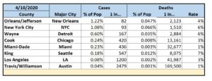
 Again, my home city of Austin is doing pretty well with only 1 in every 2479 people testing positive. New Orleans is a nightmare with 1 in every 82 people testing positive. Austin’s death rate is fairly low while Seattle is even worse than NYC and NOLA in this regard.
While the above does suggest that we’re less than a month away from stabilization (if not improvement), it assumes that the current social and business restrictions remain in-place. If they are lifted or relaxed, the model will no longer be valid. Consider that my fair warning to anyone championing a quick return to our prior normal.
